A house can have a “nice kitchen” and a “nice living room” and still feel strangely disjointed. Maybe the island turns its back on the view, the sofa floats in the wrong place, or conversations in the living room feel cut off from whoever is cooking.
That’s where interior design services before and after truly come into focus. On paper, it’s the same square footage; in reality, it’s a different home. The before is a set of rooms that were never asked how the family really lives. The after is a continuous experience—kitchen and living room speaking the same language in plan, materials, light, and comfort.
This is a look at how a full-service interior designer approaches that transformation, step by step: what typically isn’t working, what gets reimagined, and which decisions turn two adjacent rooms into one cohesive heart of the home.
The “Before”: Choppy Rooms and Competing Priorities
Most projects start with a familiar picture:
- The kitchen is efficient enough, but its island blocks the sightline to the living room. Bar stools crowd the walkway. A collection of cabinets stops abruptly at a corner, leaving awkward voids.
- The living room feels like an afterthought—either pushed too far from the kitchen or sitting in a echoey expanse, with a TV hung wherever there was a blank wall. Rugs are too small, paths cut through the seating group, and the fireplace and television fight for attention.
- Between the two spaces, the transition is muddled. Flooring might change mid-stream, lighting schemes don’t relate, and there’s no sense of a shared axis or rhythm. You can feel where the kitchen stops and the living room starts—and not in a good way.
The result is a home that makes daily life harder than it needs to be: entertaining feels cramped, kids’ homework migrates onto the island, and guests hover awkwardly because there’s no obvious place to gather.
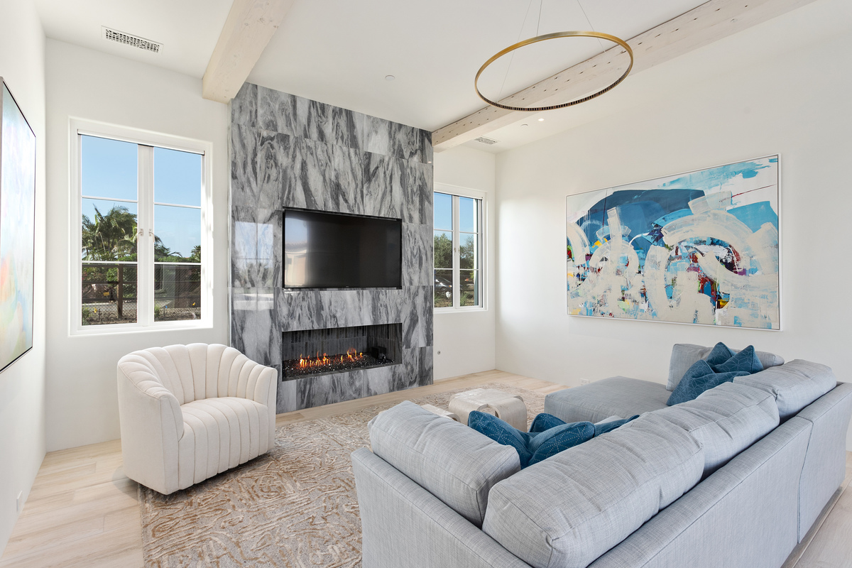
The “After”: One Room, Many Roles
In the after version, kitchen and living room are treated as one connected environment with multiple zones. You can stand at the island and converse with someone at the sofa, glance toward the terrace, and see a cohesive palette across all three.
Key characteristics of the after:
- Continuous flow: Movement from kitchen to living room feels natural, with clear paths that curve around seating instead of cutting through it.
- Aligned focal points: Fireplaces, TVs, feature walls, and key views are coordinated so that you aren’t forced to choose between watching a screen, seeing the ocean, or facing your guests.
- Unified materials: Floors, woods, stones, and metals repeat across both spaces, creating a calm, high-end backdrop that makes the whole area feel larger.
- Layered lighting and window treatments: Light levels are controllable as one—and glare or darkness in one zone doesn’t spoil the other.
The square footage hasn’t changed, but the rooms work together. That’s the hallmark of effective interior design services before and after.
Step One: Rethinking the Plan—Zoning, Flow, and Sightlines
The first move in any transformation is almost invisible: it happens in measured drawings.
In the “before”:
- Walkways are accidental; furniture is often pushed against walls or clogged around the island.
- Island seating interrupts the natural route from kitchen to living room or terrace.
- Conversations are forced to span too much distance, or the sofa faces away from where life actually happens.
In the “after”:
- The designer creates a scaled plan that starts with how the family uses the space, not with furniture catalogs. Zones are labeled—cook, prep, dine, lounge, read, watch—and then arranged in relation to each other.
- Circulation routes are protected. Clearances of 42–48 inches around islands and between major pieces ensure that people can pass comfortably, even when someone is seated or a cabinet door is open.
- Seating is arranged to create a conversation area oriented both to the kitchen and to the main focal point (fireplace, TV, or view). The sofa often floats, pulled off the wall and placed so that there’s a relaxed, legible path behind it.
- The line of travel from the front entry, or from the back terrace, is mapped to feel intentional: you’re drawn in, not dumped into the back of a sofa.
The simple before and after difference at this stage: instead of improvising around existing walls and pieces, the plan is designed to serve the people first and everything else second.
Step Two: Reworking the Kitchen–Living Relationship
Turning two rooms into one experience often depends on a few critical decisions at the seam between them.
Before: broken connection
- The island may be too long, too tall, or too close to the living area, creating a barrier rather than a bridge.
- The dining area, if present, feels wedged between kitchen and living, making neither side comfortable.
- The hearth or TV wall might live off to one side, disconnecting the living zone from the main traffic flow.
After: joined, but not jumbled
- The island is right-sized and oriented to allow people at the stools and at the sofa to make easy eye contact. Overhangs, support legs, and panel details are refined so they look finished from the living room side.
- The dining area, where space allows, is treated as a true third zone—not a leftover strip. Custom banquettes, tailored tables, and scaled lighting keep it from feeling like a no-man’s land.
- Fireplaces and media are integrated into a thoughtful feature wall that aligns to the centerline of the room and the axis of the kitchen. This can involve custom millwork, stone, or plaster to create one strong focal element instead of several competing ones.
This is where the plan begins to feel like one great room rather than two separate spaces forced to coexist.
Step Three: Custom Millwork and Storage That Make Minimalism Possible
High-end “after” photos often show serene surfaces and edited styling. What those photos don’t show is the storage that makes that possible.
Before: surfaces doing too much
- Kitchen counters host appliances, mail, chargers, and pantry overflow.
- The living room coffee table and console gather remotes, magazines, toys, and device cords because there’s nowhere else for them to go.
- Tall, standard cabinets stop abruptly, leaving random wall space and awkward gaps.
After: hidden capacity
- A scullery or working pantry, where space permits, is carved out behind or beside the kitchen. This captures small appliances, bulk goods, and even a second sink or dishwasher, so the open-plan kitchen can stay calm and clutter-free.
- A media wall in the living room conceals the TV and electronics behind paneling or sliding elements, with thoughtfully vented compartments and integrated wiring. Books, ceramics, and art get dedicated niches lit by concealed LEDs.
- Low, continuous cabinets along window walls or half-walls double as benches or display surfaces. Inside, they hide board games, throws, seasonal décor, and all the miscellany of daily family life.
The before-and-after difference here is dramatic: same family, same volume of “stuff”, but the after feels like a gallery, not a storage unit, because storage has been built into the architecture.
Step Four: One Palette, Many Textures—Materials That Unite the Rooms
In many homes, kitchens and living rooms were finished at different times or with no overarching palette. That’s why the before may feel chaotic even if each room is individually attractive.
Before: visual fragmentation
- The kitchen may feature a shiny stone, busy backsplash, and a bright metal.
- The living room may have a different wood tone, a different metal, and a completely unrelated rug palette.
- Flooring changes at the doorway between rooms, visibly chopping the space into parts.
After: a single, coherent story
- Continuous flooring, often in a rift-cut oak or similar warm wood, runs from kitchen through living, visually enlarging the space.
- Woods, stones, and metals are limited and repeated: perhaps one primary wood, one hero stone (honed, not glossy), and one metal family used across both zones.
- Upholstery and rugs in the living room are selected to complement the kitchen finishes—echoing undertones in the cabinets, island, or stone, so the view from one zone to the other feels harmonized.
- Any necessary transitions—like a change of tile in front of a fireplace or under an island—are handled with considered borders and thresholds that feel like design features, not abrupt breaks.
The after doesn’t look “matchy,” but it does feel like everything is speaking the same language: one home, one palette, multiple expressions.
Step Five: Lighting and Window Treatments That Work as One System
Even with a thoughtful plan and beautiful materials, the before often stumbles on lighting and window treatments.
Bare windows and ceiling grids are common; so is the feeling that the kitchen is bright while the living room is dim, or vice versa.
Before: disjointed light and glare
- The kitchen relies on a grid of downlights and a decorative island pendant; the living room has a fan with a kit light or a couple of random can lights.
- No consistent dimming or scene control: every switch is its own puzzle.
- Windows may be uncovered or dressed with unrelated treatments—say, a roller shade in the kitchen and heavy drapery in the living room—with no coordinated approach to glare or privacy.
After: layered light and integrated shade
- A reflected ceiling plan defines ambient, task, and accent lighting across the entire combined space. Recessed fixtures are placed according to actual use and furniture, not in a generic grid.
- Decorative fixtures—over the island, the dining table, and sometimes in the living room—are selected as a cohesive “family,” each scaled to its zone but relating in finish and style.
- Keypad scenes replace switch clutter: Cooking, Dining, Evening, Entertain, and All Off might be all you see. These scenes control the whole kitchen–living–dining expanse.
- Window treatments are planned as a single system. Motorized rollers in pockets and coordinated drapery stack-backs keep glass clear when open and provide unified light control when closed. Fabrics are chosen to complement both the hard surfaces in the kitchen and the soft ones in the living area.
The difference is palpable: in the after, you can shift from bright morning energy to a soft evening glow across all zones with one touch.
Step Six: Styling with Restraint—Letting the Architecture Lead
The final step of interior design services before and after is styling—the part where the home begins to feel personal.
Before: lots of objects, little impact
- Coffee tables, counters, and open shelves are covered with a mix of décor, gifts, and souvenirs.
- There’s no clear hierarchy of focus: everything competes for attention.
- The abundance of small pieces makes the rooms feel smaller and busier.
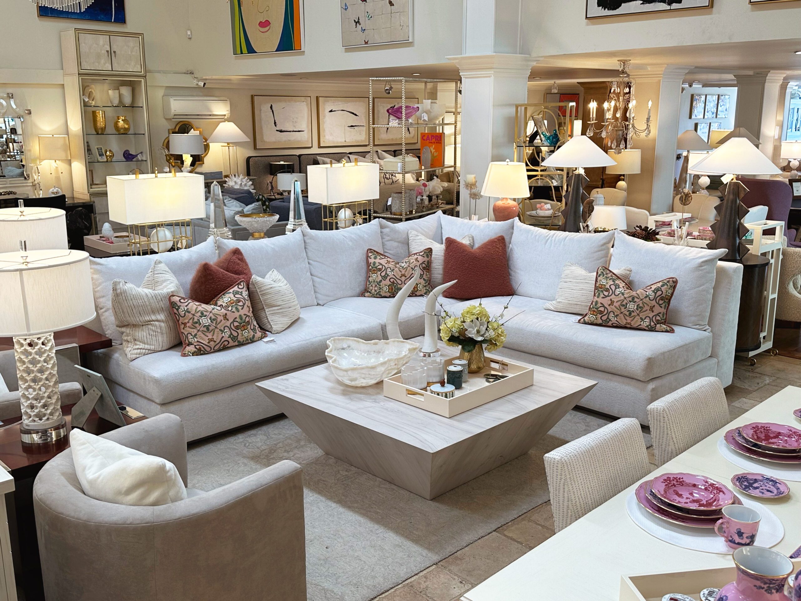
After: edited, meaningful layers
- Styling is treated as the last 10%, not the first. Once architecture, furniture, lighting, and treatments are complete, the designer brings in a curated selection of books, ceramics, vessels, and art.
- In both kitchen and living room, surfaces are kept intentionally sparse: perhaps a bowl on the island, a single sculptural object or branch on the coffee table, a thoughtful arrangement on the media console.
- Color and texture from textiles—pillows, throws, and rugs—carry more of the personality, keeping objects and countertops free to serve their real purpose.
The after isn’t about having fewer possessions; it’s about making better choices about what’s visible. Calm background, intentional foreground.
The Real “Before and After”: How It Feels to Live There
It’s easy to focus on the visual transformation, but the true measure of interior design services before and after is how the home lives:
- In the before, guests lean against the island because there’s nowhere else to gather. In the after, they naturally settle into a seating group that still feels connected to the cook.
- In the before, the TV, fireplace, and view are in competition. In the after, they’re composed, and you can enjoy each without rearranging the room.
- In the before, the kitchen stays cluttered after every meal, and the living room shows every toy and remote. In the after, storage swallows daily life so the rooms reset easily.
- In the before, moving from kitchen to living feels like crossing a line between two different design eras. In the after, it feels like walking through different chapters of the same story.
The square footage hasn’t changed. The family hasn’t changed. What’s changed is the design thinking—the careful sequence of planning, millwork, materials, lighting, and styling that turns separate kitchen and living spaces into one connected, livable whole.
Interior Design Articles