The Power of Color Palette Aesthetic
Have you ever walked into a room that made you feel energized or one that felt so soothing you could have fallen asleep instantly? Chances are, the colors of a room impacted your mood without you even realizing it. From calming blues to happy yellows, the colors of your walls, furniture, and decor all have an important role to play in your perception of a space.
Here’s how you can harness the power of color palette aesthetic to create beautiful room designs and an overall ideal atmosphere in your home.
Choose a Color Scheme
The first step to creating an aesthetically pleasing space that puts colors at the forefront of the design (without becoming overwhelming or chaotic) is to determine a color scheme. A color scheme is any combination of colors based on how they complement one another on the color wheel.
The combination can range from just a couple of colors to a series of shades that are combined to create an overall effect. When designing your space, think about using primary, secondary, analogous, complementary, intermediate, and split complementary groupings or use an interior design color palette generator to find the perfect balance.
Use Your Closet as a Model
If you’re at a loss for where to start, taking a peek inside your closet can help you zero-in on your personal color palette aesthetic. At a paint or furniture store, you might be intrigued by hundreds of brilliant color shades, but your closet knows you best.
People tend to wear the colors they enjoy the most and feel comfortable with. If you don’t wear bright colors like yellow or orange, you probably won’t like spending time in a living room that uses orange as the primary color aesthetic. Make sure your interior design style matches up with your personality instead of just going for a trendy shade.
Keep It Simple
Even if you find a series of colors you are fond of, you still might feel overwhelmed by your choices. At this point, a good rule of thumb is to stick to three main colors. By limiting your palette, you actually open yourself to a world of possibilities since boundaries often lead to creativity. Don’t forget to use your color wheel to determine which colors play off each other the best so you don’t end up with three colors that antagonize each other. This is especially important if you’re trying to create a calming atmosphere for a bedroom or a reading room.
Decorate Vertically
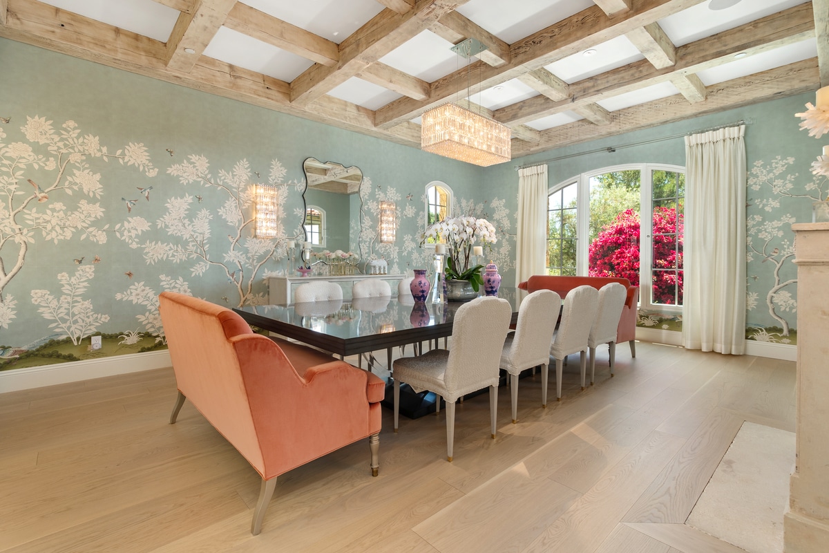
Once you have your main color palette planned out, you can work within the various hues and shades of those colors to add more depth and dimension to the room design. An easy way to make sure that your furniture, walls, and accent pieces all tie together is to work vertically, concentrating on placing dark colors at the bottom and light colors at the top. This means choosing darker color values for the floor, medium color values for the walls and some furniture, and light color values for the ceiling.
The art and science of interior design dictate that our eyes naturally travel upward, so you want to keep the focus moving in the same direction.
Use Neutral Base Layers
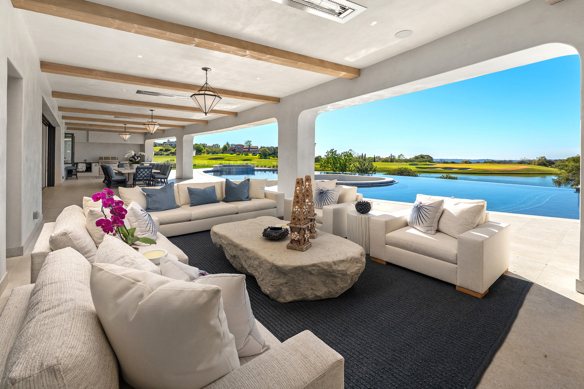
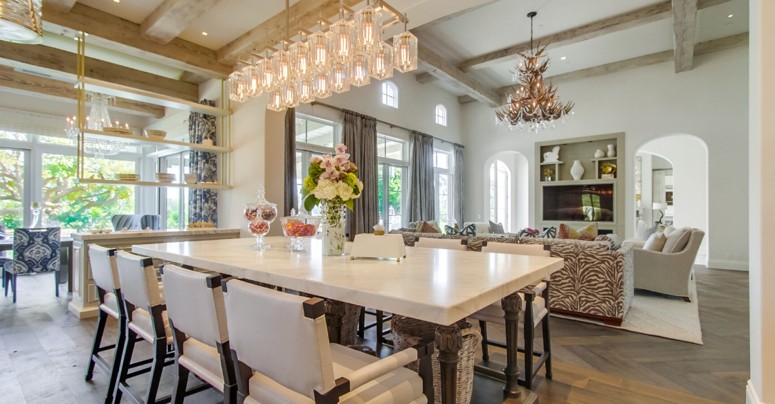
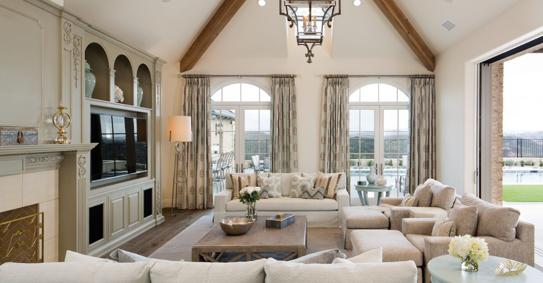
When it comes to color coordination, neutral tones—like greys, tans, and whites—in your interior design all help ground a space and make it feel more cohesive. You can think of neutral shades as a “free pass” when it comes to designing your space since they tend to blend into the background and serve to highlight the brighter colors in a room. To avoid designing a room that looks like it’s drowning in color, aim to have at least 50% of the design be comprised of neutral colors, whether those neutrals are included in the paint color, furniture pieces, or rugs.
Pick Your Pop
Your pop of color should be just that: a pop. Unless your personal style is incredibly quirky and colorful, you’ll want to keep the bold statements to a minimum to create a more refined image. Smaller spaces that are often ignored shouldn’t be slathered in white to make them appear bigger. In fact, these small spaces are the perfect place to add that vibrant burst of color that transforms your home because they naturally draw in the eye and grab the attention of anyone walking by.
Make sure you’re judicious about the color as well as the placement and how many times it appears in a room so you don’t go overboard. Consider accent pillows and accessories when looking for simple pops of color to liven up your home.
Tie It Together with Artwork
Decorating with artwork is a wonderful way to tie the interior design of a room together while expressing some of your unique personality. Because art is so emotionally-charged, you’ll want to consider its purpose in the space, placement, and coordination with the color scheme. Alternately, if you have a large piece that you absolutely adore, you could design a room around the piece and let it inspire an entire space.
Create Your Color Palette Aesthetic With Kern & Co.
Whether you’re searching for the perfect piece of high-end furniture to showcase, or you’re trying to determine the ideal color palette to create your dream aesthetic in your new home, our interior design experts at Kern & Co. are happy to help. With our expert advice and extensive classic to transitional showrooms, you’ll be able to design the room of your dreams. Contact us today to get started.
Interior Design Articles