Tour An Updated California Home With Spanish-Style Roots – Luxe Magazine
Tour An Updated California Home With Spanish-Style Roots

Rancho Santa Fe is no stranger to Best Places To Live lists. After all, the small town, whose population weighs in at just over 3,000 people, is endowed with a near-perfect climate, a bucolic feel and a wealth of elegant Spanish-style homes. Like many before them, the owners of this graceful estate came to the area seeking the good life. “The weather is beautiful here; it’s truly a Mediterranean climate in a lovely part of California,” says the wife.
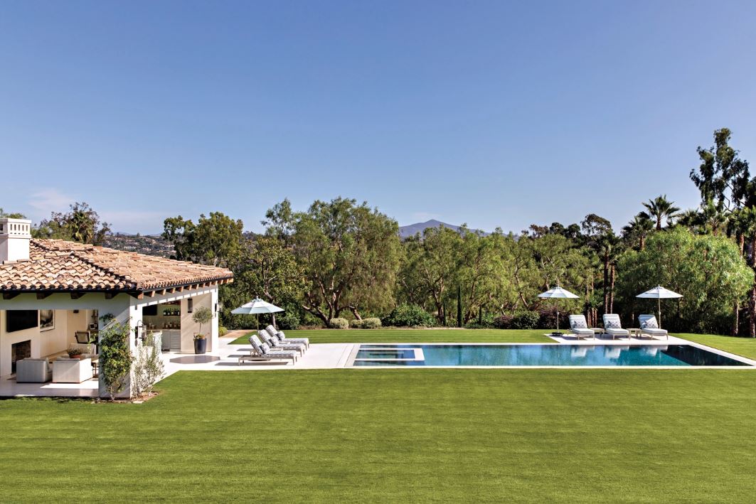
When she and her husband relocated from the northern part of the state, they were dreaming of a residence that capitalized on everything the region had to offer. Indoor-outdoor living year-round was an especially enticing option. After weighing the possibility of building from scratch on an empty lot, the couple ultimately decided to remodel an existing home, lured by a lush site dotted with mature trees and plants. Their design team—architect John P. Jensen, designer Susan Spath, general contractor Josh Herbst and landscape architect Steve Ahles—was charged with stripping the house and recreating it as a light-filled, contemporary abode. That is, one where its residents could easily wander outside to the patio and then down to the pool, or drift toward one of multiple outdoor entertaining areas.
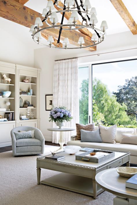
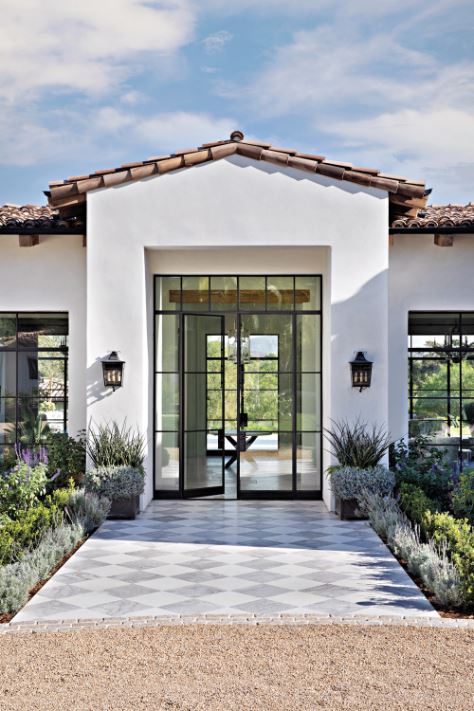
“The home had good bones and a dated style,” recalls Jensen. “Now it pays homage to its traditional Spanish-style roots, but is updated for the current times. We kept the skeleton and gave it a new skin.” That’s not to say the skeleton itself didn’t get a major boost. The basement level was sealed off to make way for an expansive patio and, as a result, the now-single-level dwelling is better connected to the backyard. Inside, compartmentalized rooms were replaced by an open floor plan and the ceilings were elevated.
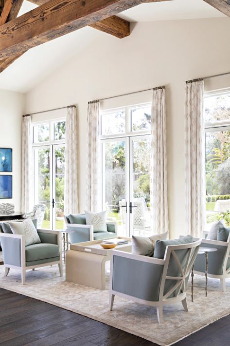
The benefits of such a dramatic remodel came with an inherent design danger: brand-new houses can sometimes read sterile without the benefit of patina. “But,” notes Spath, “everywhere you go in this home, your eyes land on something interesting, or that has a little bit of history.” To wit, the owners brought along a collection of antiques and photographs—including some of the earliest photos ever taken from the late 1800s. “Antiques and vintage pieces give a room warmth and character—they make for an ageless quality,” explains the designer. This is precisely the aesthetic the residents hoped for, and pieces such as a pair of burl-wood commodes and large gilded mirrors deliver it in spades.
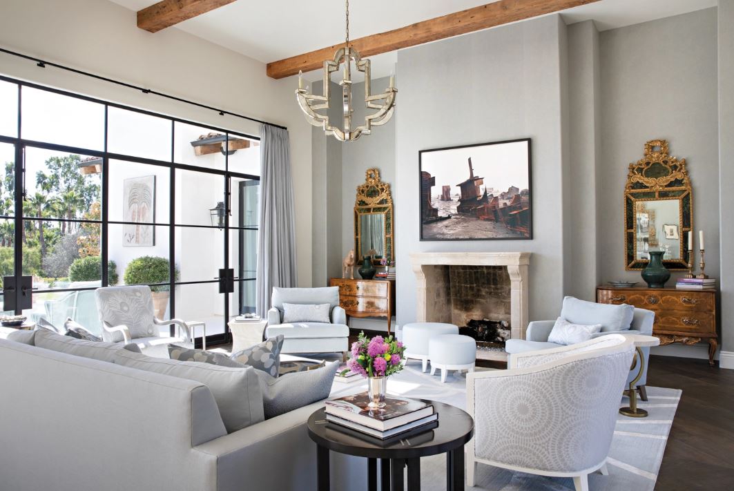
Various surfaces convey a dose of that mellow luster that comes with age, too. “It starts with the limestone floors,” says Spath. “I also brought in character with an antique fireplace surround and mantel.” These light-colored stones meet with rustic wood floors and ceiling beams, assuring that such appellations as “monotonous” and “expected” do not apply here.
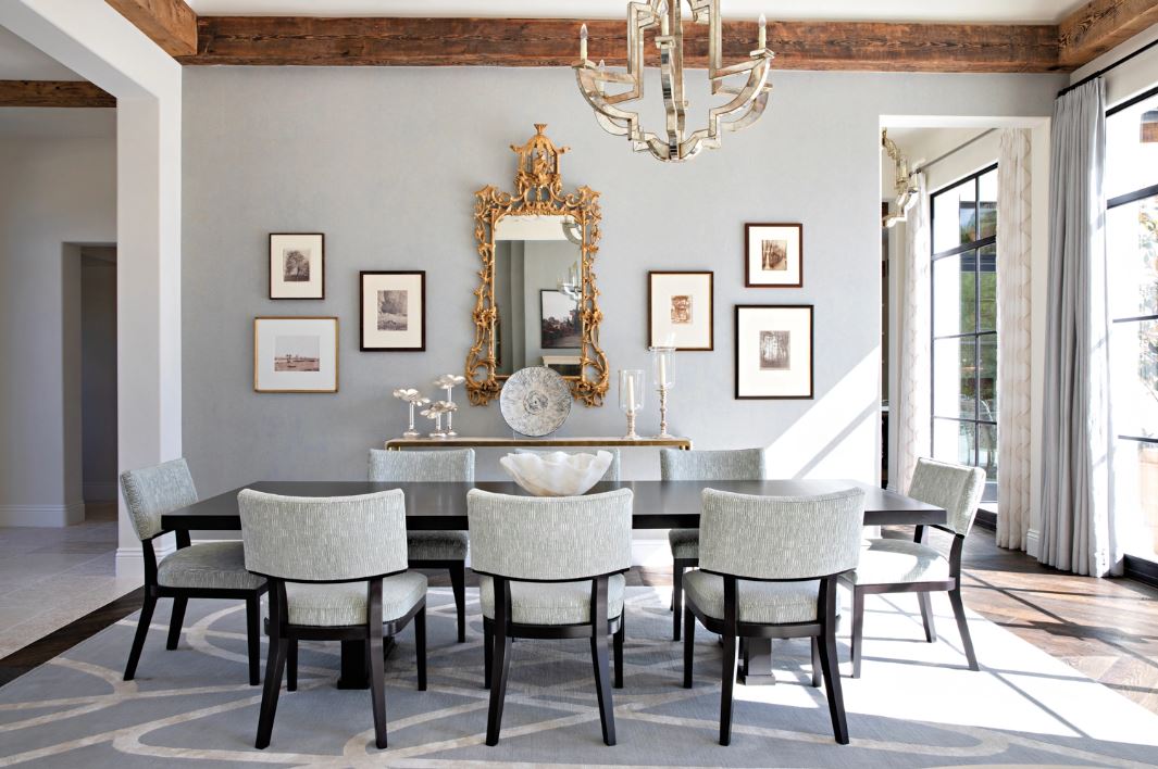
Meanwhile, new materials provide a pleasing contrast of their own. “Before the remodel, the windows were small and less minimal,” remembers Jensen. “Adding larger, thinner metal windows and doors gave spaces a lighter feel.” The wife, who says they were striving for a “Santa-Barbara style,” agrees: “In addition to letting in a lot of light, the steel windows add a pop of modern style.”
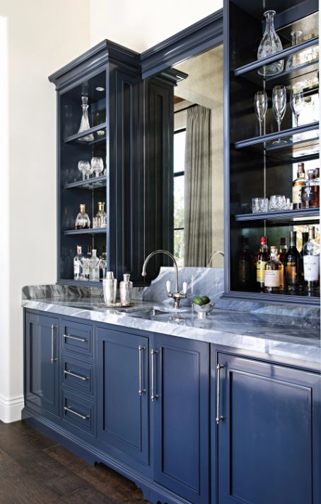
All these elements are united by a serene, collected color palette. “I would describe it as bright, fresh and very relaxing,” says Spath, who used cream, white, spa green and French blue throughout the abode—primarily soft, feel-good hues. Reflecting on these choices, the designer adds: “When you’re in such a bright house, fresh colors add a certain lightness of being.”
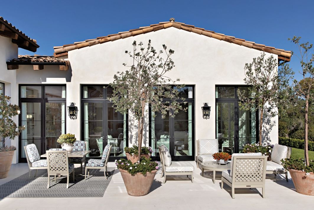
That very lightness was the whole point. “It’s all about lifestyle. These are elegant people who wanted an understated elegance in their home,” explains Spath. “There are formal notes, but they’re pared down a bit. This is a house that’s more serene and lovely now, and much less stuffy and traditional.”
Written by Mary Jo Bowling for Luxe Interiors + Design
See whole article here
- Photography: Karyn Millet
- Architecture: John P. Jensen, John P. Jensen Architect
- Interior Design: Susan Spath, Kern & Co.
- Home Builder: Josh Herbst, Herbst Construction, Inc.
- Landscape Architecture: Steve Ahles, Ahles Landscape Architecture


