More Than Aesthetics — The Emotional Power of Color
Color holds immense influence within interior design, reaching far beyond visual impact. It shapes emotional responses, alters perceptions of space, and influences behavior. Every hue evokes unique psychological reactions, capable of calming, energizing, or grounding the people who experience it.
A thoughtfully curated color palette balances personal expression with the subconscious effects of each tone. When used strategically, color becomes one of the most powerful tools for shaping both mood and functionality in luxury interiors.
The Science Behind Color Psychology
How Colors Influence Brain and Body
Color operates through light wavelengths, directly affecting neurological and hormonal responses. For example, red’s short wavelengths stimulate alertness, while blue’s longer wavelengths promote relaxation. These physiological reactions are often universal, though cultural associations may also shape emotional interpretations.
While Western design may link white with purity, some cultures associate it with mourning. Understanding both innate and learned responses ensures that color choices align with intended emotional outcomes.
The Subconscious Impact of Color in Daily Life
Our environments constantly influence mental energy, focus, and emotional regulation. Scientific studies demonstrate that exposure to specific colors can enhance productivity, improve mood stability, and even reduce cortisol levels. Office spaces painted in calming hues show measurable increases in concentration, while warm-toned kitchens can boost appetite and social engagement.
Color subtly directs how occupants function within their spaces, making its selection a foundational design consideration.
Emotional Profiles of Key Colors in Interiors
Blue: Calm, Trust, Serenity
Blue fosters tranquility, clarity, and stability. Its association with open skies and calm waters evokes feelings of peace and spaciousness, making it ideal for bedrooms, bathrooms, and home offices. Pale blues induce softness and restfulness, while navy and deep cobalt offer grounded sophistication. In workspaces, blue supports mental clarity without overstimulation.
Green: Balance, Renewal, Wellness
Rooted in nature, green symbolizes renewal, growth, and equilibrium. Biophilic design principles often leverage green to create soothing environments that promote well-being. Sage and olive tones bring understated calm to kitchens and living rooms, while vibrant emerald accents infuse spaces with energetic vitality. Meditation rooms and wellness areas benefit from green’s natural harmonizing effect.
Yellow: Optimism, Energy, Warmth
Yellow radiates positivity, optimism, and brightness. In kitchens, breakfast nooks, and sunrooms, soft yellows elevate mood and stimulate sociability. However, in high-stress areas like bedrooms, overuse of saturated yellows may cause restlessness. Pale buttery tones provide gentle warmth, while bold sunflower hues make confident design statements.
Red: Passion, Power, Drama
Red commands attention and stirs emotional intensity. Its bold energy can stimulate conversation and appetite, making it effective for dining rooms and libraries. Deep burgundy or oxblood shades introduce refined drama, while brighter reds infuse spaces with vibrancy. Because of its stimulating qualities, red works best in moderation to avoid overwhelming the senses.
Neutrals: Sophistication, Calm, Versatility
Neutrals offer timeless versatility, creating a foundation for layering personal style. Warm neutrals—such as beige, taupe, and sand—promote comfort and coziness, while cool grays and greige evoke understated elegance. Undertones play a critical role: a hint of pink warms a gray, while blue undertones can cool a beige. Proper undertone selection ensures harmony across all furnishings and finishes.
Black: Luxury, Depth, Elegance
Black exudes sophistication, grounding spaces with depth and bold refinement. Used sparingly in cabinetry, powder rooms, or accent walls, it introduces high drama. Soft black or charcoal tones create moody, intimate environments that pair beautifully with metallics and warm wood tones. Balanced with ample light, black elevates modern and classic designs alike.
White: Purity, Freshness, Space
White embodies simplicity, purity, and openness. It reflects maximum light, visually expanding rooms and creating a clean backdrop for layering textures and accents. However, undertone selection is vital: warm whites soften and invite, while cool whites provide crisp modernity. Lighting conditions throughout the day can subtly shift a white’s appearance, necessitating careful swatch testing.
Aligning Color Choices With Personality
The Extrovert vs. Introvert Palette
Extroverts may gravitate toward bold contrasts, vibrant combinations, and energetic hues that express outward confidence. Bright reds, oranges, and jewel tones suit sociable, dynamic spaces.
Introverts often prefer calming monochromes, muted earth tones, and layered neutrals that promote introspection and tranquility. Subtle shifts in tone offer complexity without overwhelming the senses.
Lifestyle-Informed Color Decisions
Homeowners who frequently entertain may opt for inviting, vibrant palettes that encourage conversation and warmth. In contrast, wellness-focused households often seek restorative earth tones, soft greens, and neutrals that foster serenity and relaxation.
Lifestyle priorities—whether hosting, working, or retreating—inform which palettes create optimal daily comfort.
Signature Palettes for Personal Expression
Designers often collaborate with clients to develop “signature palettes”—harmonized color stories that reflect personal identity while respecting long-term livability. Balancing personal taste with timeless appeal ensures that spaces remain relevant as trends evolve.
Subtle infusions of seasonal or trending colors can refresh interiors without compromising the core palette’s longevity.
Strategic Color Placement by Room
Bedrooms: Calm and Restorative Palettes
Bedrooms benefit from restful, soothing hues. Soft blues, muted greens, warm neutrals, and gentle pastels promote relaxation and deeper sleep. Subtle tonal variations provide interest without sacrificing tranquility.
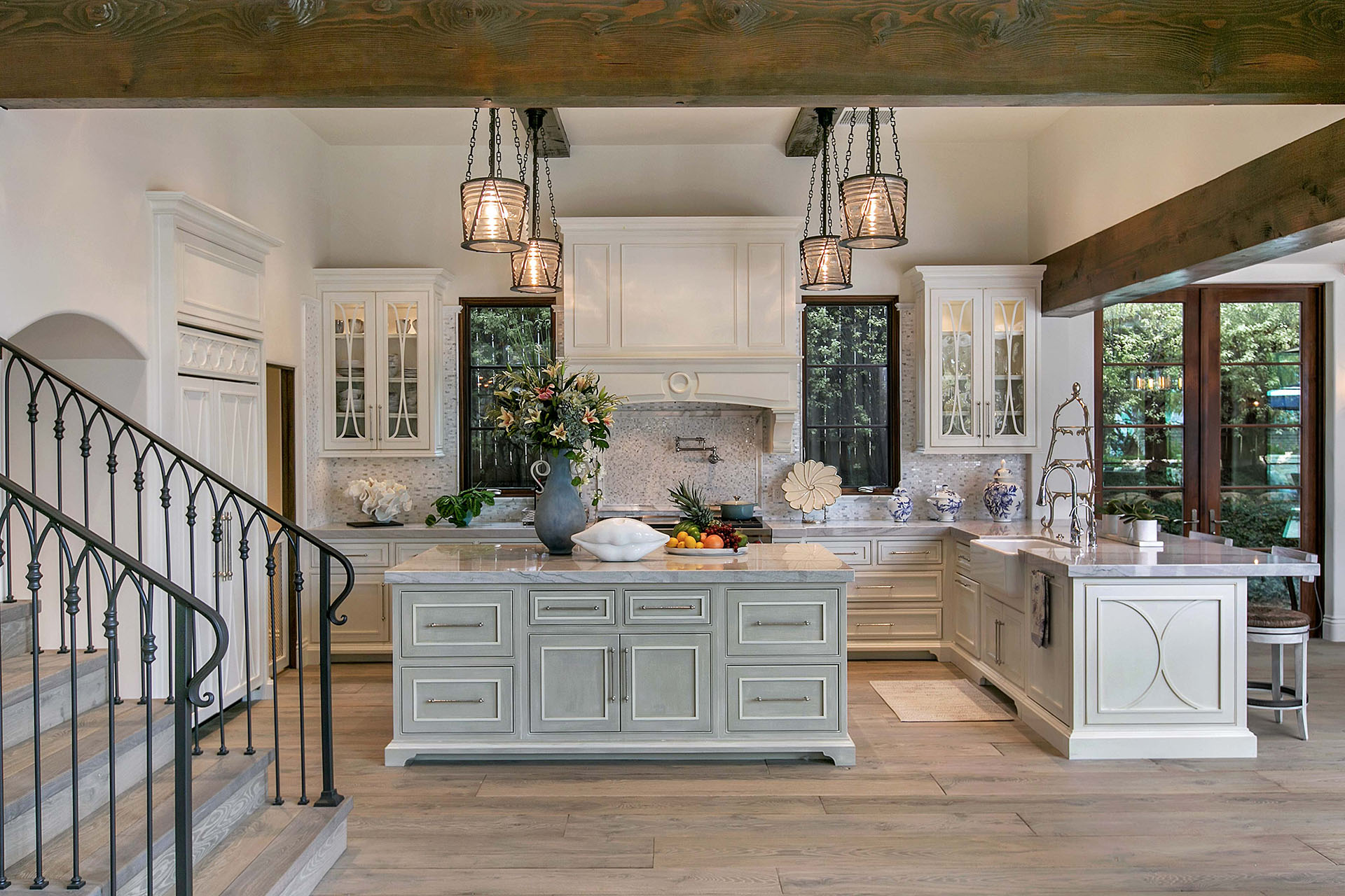
Kitchens: Energy and Social Warmth
Kitchens thrive with lively yet balanced palettes. Whites, soft yellows, pale greens, and select vibrant accents paired with neutrals create welcoming, energizing environments that encourage gathering and interaction.
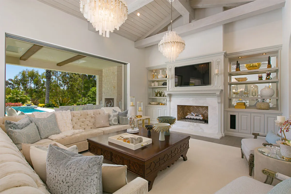
Living Rooms: Versatile, Inviting Foundations
Living areas often serve multiple purposes, making flexible palettes essential. Neutrals layered with soft earth tones, rich blues, or statement accents allow for easy seasonal updates while remaining cohesive.
Bathrooms: Spa-Like Serenity
Bathrooms become sanctuaries with light-reflective hues. Soft blues, greens, pale taupes, and sophisticated darks transform powder rooms into intimate retreats while maximizing a sense of cleanliness and luxury.
Home Offices: Focus and Clarity
Home offices benefit from colors that promote concentration and mental clarity. Muted blues, soft greens, and warm neutrals minimize visual fatigue while maintaining focus and productivity throughout the workday.
Color as the Soul of Interior Design
Color shapes the emotional and functional experience of home. Its ability to influence mood, define identity, and transform space elevates it from simple decoration to an essential design element.
With thoughtful selection and expert guidance, color becomes a living expression of both personality and lifestyle—a foundation for luxury living that nurtures beauty, wellness, and daily joy.
Ready to curate a palette that reflects your personality and enhances your living environment? Schedule a consultation with Kern & Co. and let our design team transform your space through the power of color.
Frequently Asked Questions
What mood do different colors create?
Colors influence emotions: blues calm, greens balance, yellows uplift, reds energize, neutrals soothe, and darks ground. Each tone creates a distinct atmosphere aligned with its psychological profile. Subtle shifts in shade and saturation can further fine-tune emotional responses.
How do I choose colors that reflect my personality?
Work with your designer to explore your lifestyle, energy, and preferences, then select tones that feel authentic yet timeless. Professional guidance ensures the palette remains balanced and adaptable. Testing colors in your space under different lighting conditions helps finalize confident choices.
Can paint color affect how large a room feels?
Yes. Light colors visually expand space, while darker hues create intimacy and bring large spaces into balance. Strategic accent placement can also shift perceived room dimensions. Ceiling color, trim contrast, and flooring selection further contribute to the sense of spaciousness or coziness.
Interior Design Articles