Color is more than just a visual element—it’s a powerful psychological tool that influences emotions, productivity, and even physical responses. In interior design, the right color palette can create a sense of calm, energy, warmth, or focus, transforming a space to support well-being and functionality.
Understanding color psychology allows homeowners and designers to make informed choices when selecting wall colors, furniture, and décor accents. Whether you want to boost energy in a home office, promote relaxation in a bedroom, or encourage conversation in a living room, the right hues can set the perfect mood.
This guide explores the science behind color psychology, breaking down how different colors impact emotions and behavior—so you can craft interiors that enhance both aesthetics and well-being.
The Science Behind Color Psychology
Color psychology is the study of how different hues affect human emotions, perceptions, and behaviors. It’s used in marketing, branding, and interior design to shape experiences and influence decision-making.
How Colors Affect Mood & Behavior
✔ Warm Colors (Red, Orange, Yellow): Stimulate energy, passion, and warmth.
✔ Cool Colors (Blue, Green, Purple): Promote relaxation, calm, and focus.
✔ Neutral Colors (White, Gray, Beige): Create balance, sophistication, and versatility.
Color influences mood because it’s processed in the limbic system, the part of the brain that controls emotions, memory, and motivation. This is why certain colors evoke strong emotional responses—a bold red wall might increase energy, while a soft blue room encourages tranquility.
Now, let’s break down how specific colors impact mood and function in interior spaces.
Warm Colors: Energizing & Inviting
1. Red: Passion, Energy, and Warmth
Red is one of the most stimulating colors, evoking emotions of passion, excitement, and intensity. It increases heart rate and blood pressure, making it a powerful color for social spaces.
✔ Best For: Dining rooms, living rooms, entertainment areas.
✔ Avoid In: Bedrooms (can feel overwhelming), offices (may increase stress).
✔ Pair With: Neutrals like white or beige for balance, or deep blues for contrast.
Design Tip: A red accent wall in a dining room encourages appetite and conversation, which is why many restaurants incorporate red in their branding.
2. Orange: Creativity & Enthusiasm
Orange is an uplifting, fun color that inspires creativity and enthusiasm. It combines the warmth of red with the cheerfulness of yellow, making it a great color for social or active spaces.
✔ Best For: Playrooms, workout spaces, kitchens.
✔ Avoid In: Bedrooms (too stimulating), small rooms (can feel overwhelming).
✔ Pair With: Cool tones like gray or blue for balance.
Design Tip: Use burnt orange or terracotta for a sophisticated, earthy feel instead of bright orange, which can feel overwhelming.
3. Yellow: Happiness & Optimism
Yellow is associated with sunlight, joy, and energy, making it one of the most mood-boosting colors. It’s ideal for brightening up spaces and making them feel more welcoming.
✔ Best For: Kitchens, bathrooms, entryways.
✔ Avoid In: Bedrooms (too stimulating for rest), offices (can cause restlessness).
✔ Pair With: Soft white, gray, or navy blue for a balanced look.
Design Tip: Use pale yellows for a calming effect or bold mustard for a trendy, modern feel.
Cool Colors: Calming & Focused
4. Blue: Relaxation & Productivity
Blue is known for its calming and serene effects, making it ideal for bedrooms, offices, and relaxation spaces. It’s also linked to increased productivity, making it a favorite in corporate settings.
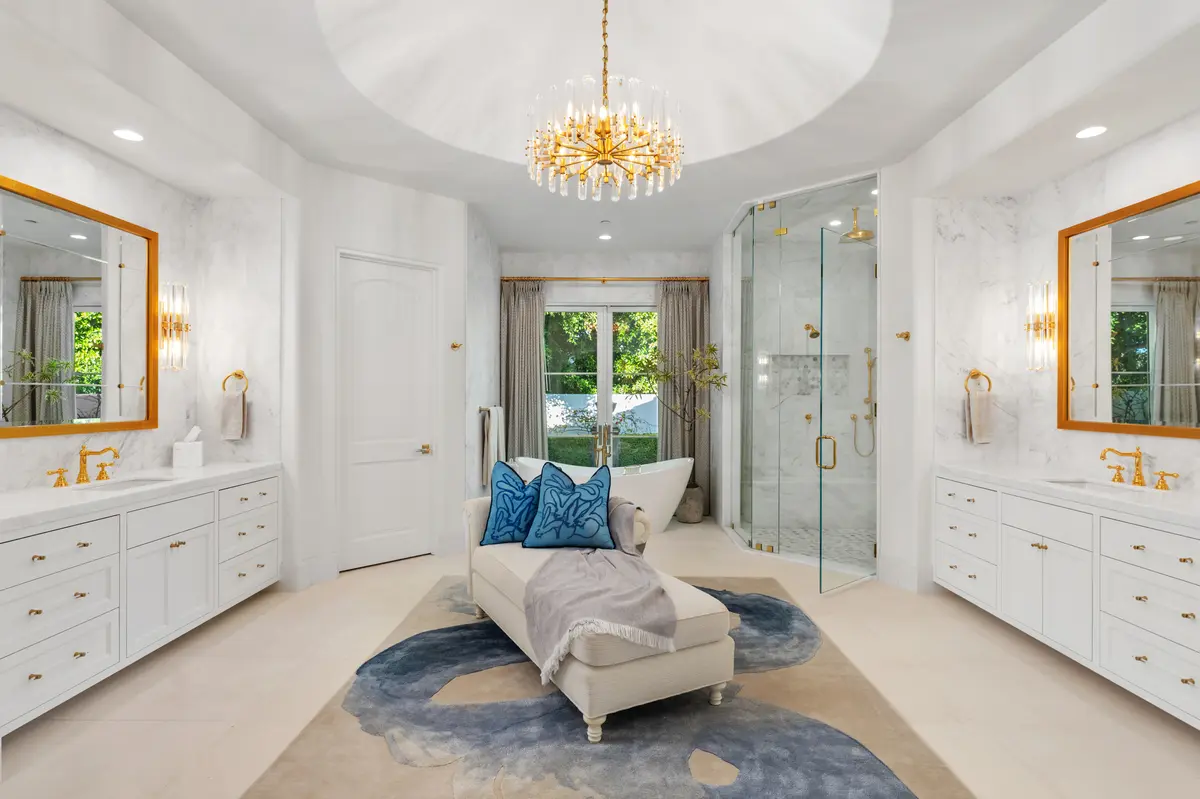
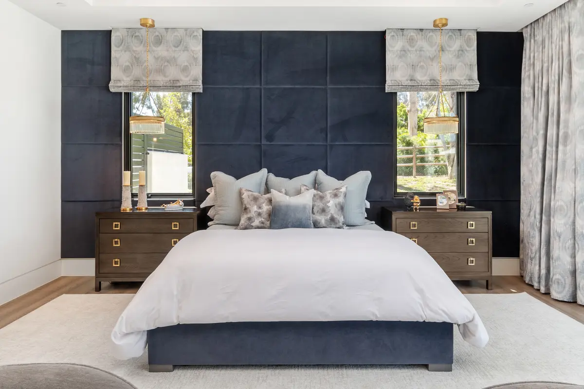
✔ Best For: Bedrooms, offices, bathrooms.
✔ Avoid In: Dining rooms (can reduce appetite), dark blue in small rooms (can feel too cold).
✔ Pair With: Whites, grays, or warm wood tones for contrast.
Design Tip: Soft sky blue promotes relaxation, while navy blue adds a sophisticated touch.
5. Green: Balance & Nature
Green symbolizes growth, harmony, and renewal, making it one of the most restorative colors. It connects us to nature and has been shown to reduce stress.
✔ Best For: Living rooms, bedrooms, meditation spaces.
✔ Avoid In: Overuse in dark green tones can feel heavy.
✔ Pair With: Earthy tones like beige and brown, or crisp white for contrast.
Design Tip: Olive or sage green works beautifully in modern interiors, while emerald green adds a luxurious, dramatic feel.
6. Purple: Luxury & Creativity
Purple combines the calm of blue with the energy of red, often associated with royalty, creativity, and sophistication.
✔ Best For: Bedrooms, creative studios, luxury-inspired spaces.
✔ Avoid In: Workspaces where excessive relaxation is counterproductive.
✔ Pair With: Gold accents for an opulent look, or soft grays for a contemporary feel.
Design Tip: Use lavender or lilac for a soft, dreamy atmosphere, or deep plum for a bold, elegant effect.
Neutral Colors: Versatile & Timeless
7. White: Clean & Minimalist
White creates a sense of openness and freshness, making it perfect for small spaces or minimalist interiors.
✔ Best For: Any room, especially kitchens and bathrooms.
✔ Avoid In: High-traffic areas (can feel sterile or require frequent cleaning).
✔ Pair With: Any accent color for a modern look.
Design Tip: Off-white or warm ivory adds coziness compared to stark white.
8. Gray: Sophisticated & Balanced
Gray is neutral, calming, and versatile, making it a popular modern interior color.
✔ Best For: Living rooms, bedrooms, offices.
✔ Avoid In: Rooms without natural light (can feel cold or dull).
✔ Pair With: Warm wood tones or pops of color like mustard or navy.
Design Tip: Use light gray for an airy feel and charcoal gray for a dramatic effect.
9. Beige & Taupe: Warm & Inviting
Beige and taupe are warm neutrals that create a cozy, inviting environment.
✔ Best For: Living rooms, bedrooms, open spaces.
✔ Avoid In: Minimalist designs needing more contrast.
✔ Pair With: Green, navy, or burgundy for a refined look.
Design Tip: Add textured fabrics and layered lighting to prevent beige interiors from looking flat.
Selecting the right color palette can transform your home into a space that promotes well-being, focus, and comfort.
✔ Warm colors energize and stimulate, ideal for social spaces.
✔ Cool colors calm and focus, great for bedrooms and offices.
✔ Neutral colors offer balance and flexibility for any space.
By understanding color psychology, you can create interiors that enhance mood and function, ensuring your home feels as good as it looks.
Interior Design Articles