Color plays a transformative role in home design. It dictates mood, enhances architectural elements, and creates a harmonious flow between spaces. The right color palette can make a small room feel expansive, a cold space feel warm, or an ordinary home feel elegantly curated. However, selecting the perfect hues requires more than simply picking a favorite shade—it involves a technical understanding of color theory, psychology, and design balance.
This guide breaks down the fundamentals of color selection, explores interior color trends, and provides practical steps to create a cohesive palette. Whether you’re refreshing a single room or revamping an entire home, mastering the art of paint selection and mood boards ensures a timeless and well-balanced aesthetic.
The Fundamentals of Color Theory
Color theory is the foundation of every successful interior design. It dictates how colors interact, influence perception, and evoke emotional responses. Understanding basic color relationships ensures that your chosen palette creates a cohesive and visually appealing space.
The Color Wheel and Its Applications
The color wheel is an essential tool for pairing complementary shades and understanding how different hues interact.
- Primary Colors: Red, blue, and yellow—these cannot be mixed from other colors.
- Secondary Colors: Green, orange, and purple—created by mixing two primary colors.
- Tertiary Colors: Blends of primary and secondary colors, such as teal, vermillion, and chartreuse.
When applying color theory to interior design, consider the following principles:
- Monochromatic Scheme: Uses different tints and shades of a single color, creating a sophisticated, seamless look.
- Analogous Scheme: Uses three colors adjacent to each other on the wheel (e.g., blue, teal, and green) for a calm, coordinated aesthetic.
- Complementary Scheme: Opposite colors (e.g., blue and orange) create striking contrast, adding vibrancy to focal points.
A well-balanced color palette respects these relationships, ensuring harmony rather than visual discord.
The Psychological Impact of Color
Color psychology plays a crucial role in home design. It affects how spaces feel and function, influencing mood, energy levels, and even productivity.
Emotional Associations of Popular Interior Colors
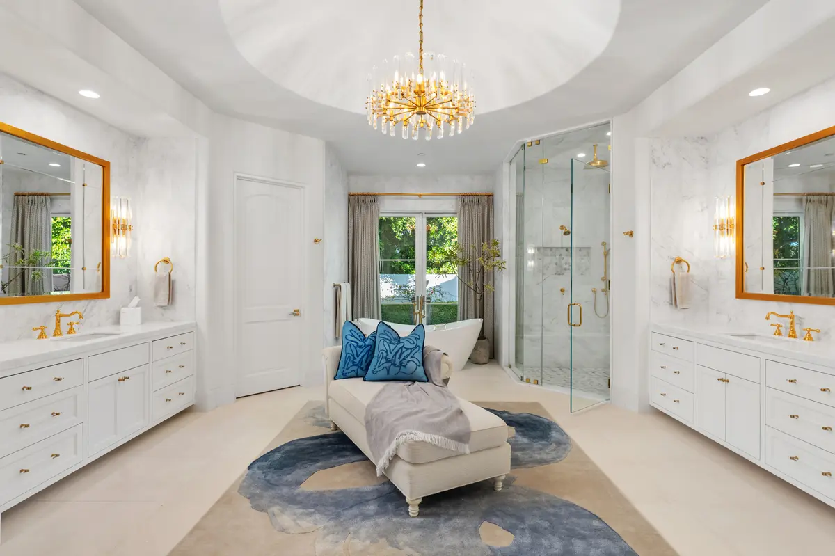
- Neutral Shades (White, Beige, Gray): Timeless and versatile, neutrals create a calm and elegant atmosphere, allowing decor elements to stand out.
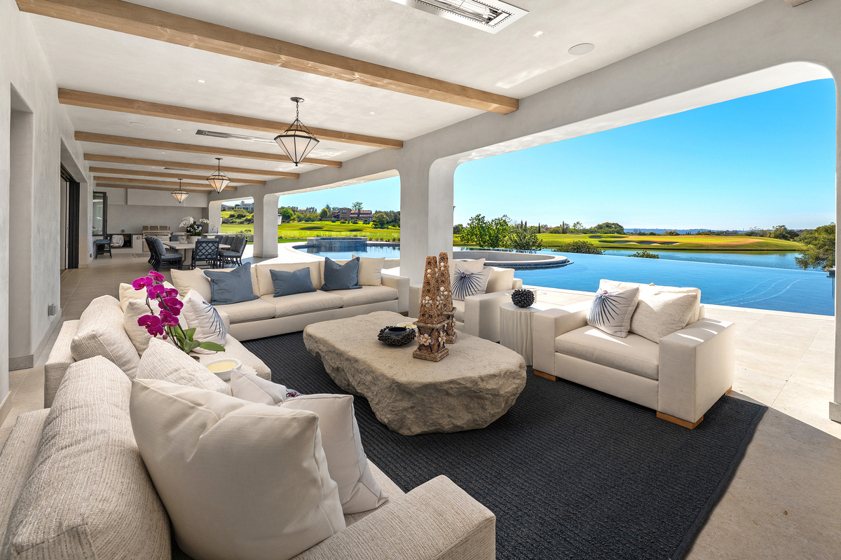
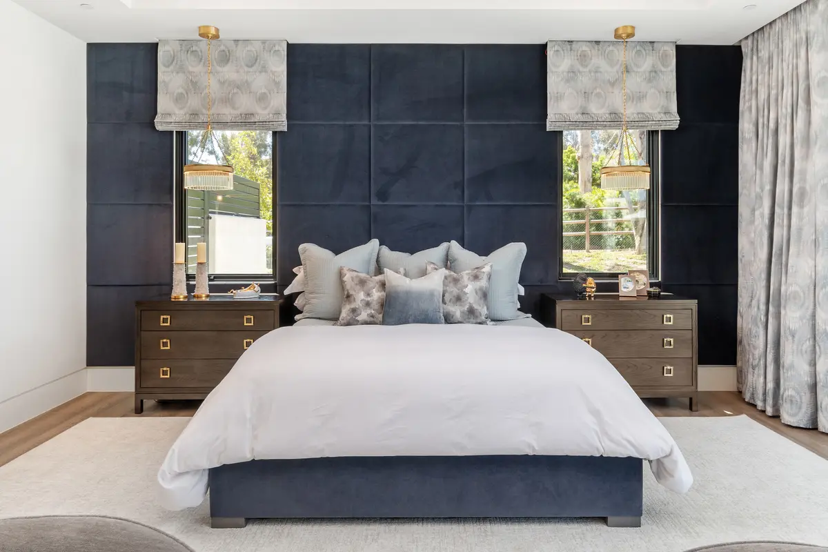
- Blues & Greens: Cool tones that evoke serenity and relaxation, making them ideal for bedrooms, bathrooms, and home offices.
- Warm Tones (Red, Orange, Yellow): Stimulating and lively, these shades enhance social spaces like kitchens and dining areas.
- Earthy Hues (Terracotta, Olive, Sandstone): Organic and grounding, these colors promote coziness and a connection to nature.
Each shade influences perception differently—choosing the right one ensures that every space serves its intended emotional purpose.
Interior Color Trends: What’s In Right Now?
Interior color trends evolve based on design movements, technological advancements, and cultural shifts. In 2024, calm yet sophisticated tones are taking center stage, with a focus on organic influences and moody accents.
Trending Palettes in Modern Interiors
- Muted Earth Tones: Inspired by nature, burnt sienna, sage green, and deep ochre bring warmth and depth.
- Soothing Blues & Greens: From soft eucalyptus to deep navy, these shades add a refreshing yet timeless feel.
- Rich, Moody Neutrals: Shades like mushroom beige, taupe, and soft charcoal offer depth without overwhelming a space.
- Jewel-Toned Accents: Deep emerald, sapphire, and plum create luxurious statement walls and cabinetry.
Trends provide inspiration, but selecting colors that align with personal style and long-term appeal ensures lasting beauty.
How to Select the Perfect Paint Colors
Choosing the right paint colors involves more than picking a swatch—it requires testing, layering, and considering environmental factors.
Key Considerations for Paint Selection
- Assess Natural & Artificial Lighting
- A color may look completely different in daylight vs. warm artificial light. Always test paint swatches on your walls before committing.
- Understand Undertones
- White isn’t just white—some have warm yellow undertones, while others lean cool with blue or gray tints.
- Consider Room Functionality
- Lighter shades make small rooms feel expansive, while deeper hues add intimacy to large spaces.
- Choose the Right Paint Finish
- Matte: Elegant but prone to scuffing (best for ceilings and bedrooms).
- Eggshell/Satin: Soft sheen with durability (ideal for living rooms and hallways).
- Gloss/Semi-Gloss: Reflective and moisture-resistant (perfect for kitchens and bathrooms).
Selecting the right combination of shade, tone, and finish ensures visual appeal and longevity.
Creating a Mood Board for Cohesive Design
A mood board is a crucial step in designing a harmonious color scheme. It provides a visual roadmap, ensuring that paint colors, furnishings, and decor work seamlessly together.
How to Build an Effective Mood Board
- Collect Inspiration
- Gather fabric samples, magazine clippings, and digital images that align with your vision.
- Define a Dominant Hue
- Choose a primary color that sets the tone for your space.
- Incorporate Accent Shades
- Add secondary and tertiary colors for balance.
- Test Color Pairings
- Arrange paint swatches alongside textures and furniture materials to see how they interact.
Using a well-planned mood board prevents disjointed aesthetics, ensuring every element flows cohesively.
Common Mistakes to Avoid When Choosing Colors
Selecting colors without proper planning can lead to overwhelming, clashing, or uninspired interiors. Avoid these common errors to ensure a polished result.
Top Color Mistakes to Watch For
- Ignoring Undertones: Even neutral shades have subtle cool or warm undertones that shift in different lighting.
- Skipping Paint Samples: A color on a swatch may not look the same on a large-scale wall. Always test samples.
- Overusing Bold Colors: Bright hues are best used as accents rather than dominant wall colors.
- Disrupting Room Flow: Spaces should transition seamlessly rather than feeling disjointed with clashing shades.
By avoiding these pitfalls, homeowners can create balanced, intentional color schemes.
Conclusion
Color selection is an art form—it requires a blend of science, intuition, and technical expertise. The right color palette doesn’t just define aesthetics; it sets the tone for an entire home. By understanding color theory, embracing modern trends, and carefully testing selections, homeowners can create visually stunning, emotionally resonant spaces.
A well-chosen color scheme ensures timeless beauty, comfort, and sophistication. For professional interior design services in Solana Beach, CA, Kern & Co specializes in crafting color palettes that elevate every space with precision and style.
Interior Design Articles