Patterns bring a room to life. They inject energy, tell stories, and express personality with flair. But when handled without intention, they can just as easily overwhelm a space, leaving it feeling chaotic or mismatched. The art of pattern mixing lies in striking a perfect balance—creating a dialogue between prints rather than letting them compete for attention.
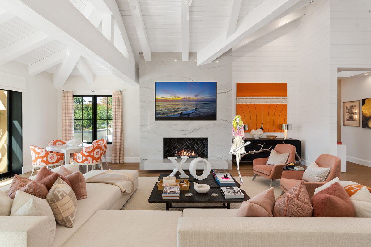
At Kern & Co., where elegance meets bold expression, the use of pattern is never accidental. Whether designing a tranquil Solana Beach retreat or curating a lively coastal living room, the goal remains the same: achieving cohesive design through thoughtful coordination of scale, color, and rhythm.
Understanding the Basics of Pattern Mixing
Before diving into layering florals with stripes or geometrics with ikats, it’s essential to understand how patterns interact. Each one brings a different visual weight, tempo, and emotional tone to a room. Mixing them successfully requires a plan rooted in visual harmony.
There are three key variables to balance:
- Scale: Combine large-scale prints with smaller, more delicate patterns to avoid visual competition. For instance, a bold, oversized floral works beautifully with a pinstripe or subtle dot.
- Color palette: Stick to a consistent family of colors—perhaps neutrals with one or two accent tones. This keeps even wildly different patterns grounded in unity.
- Style cohesion: Mixing modern chevrons with vintage toile might feel disjointed unless there’s a deliberate link—such as color, mood, or texture—to connect them.
When in doubt, let one pattern lead and use the others to support.
Stripes: The Foundation of Pattern Play
Stripes are the most versatile players in the pattern game. They’re clean, linear, and can swing traditional or contemporary depending on their thickness, orientation, and color.
Vertical stripes elongate a space and lend formality. Horizontal stripes expand a room visually and bring casual charm. Diagonal or chevron patterns add movement and energy.
Stripes also act as the grounding pattern in many rooms—they’re the visual “neutral” that makes layering more complex prints feel intentional. For example, pairing navy ticking stripes with watercolor florals instantly creates a coastal-inspired harmony without feeling forced.
Florals: Softness and Organic Flow
Floral patterns offer a sense of nature, romance, and movement. Whether delicate and detailed or abstract and bold, they bring softness to interiors that may otherwise feel too rigid or minimal.
To integrate florals in a cohesive way:
- Keep the color palette aligned with the room’s core tones.
- Balance them with geometrics or solids that add structure.
- Consider the mood—oversized blooms feel more modern, while petite florals lend vintage charm.
In Solana Beach homes, where interiors often blend indoor and outdoor living, floral prints bridge the gap beautifully—bringing natural motifs indoors and infusing spaces with a coastal breeze.
Geometric Prints: Structure and Edge
Geometric patterns—think hexagons, herringbone, and lattice—bring a structured, contemporary flair to a room. They introduce rhythm, repetition, and a strong visual framework.
The key with geometrics is restraint. Too many sharp lines can make a space feel mechanical. Soften their edges by pairing with organic prints, such as florals, or natural textures like linen, rattan, or reclaimed wood.
Consider using geometrics in smaller doses—on throw pillows, an accent wall, or an area rug—to create interest without overtaking the space. Balance is everything.
Animal Prints and Abstract Motifs: Adding Personality
Animal prints, brushstroke designs, tribal patterns—they all add a layer of unpredictability and bold personality. These prints are best used as accents in a well-balanced space.
A leopard-print bench cushion or a zebra-patterned rug can become a statement piece if the rest of the room leans neutral. Abstract motifs in muted tones—like soft, painterly brushstrokes—can act as both pattern and texture, especially when echoed in wall art or accessories.
Use these prints sparingly, as you would a bold spice in a well-seasoned dish.
How to Layer Patterns Without Clashing
Pattern mixing isn’t about matching—it’s about coordinating.
Here’s a tried-and-true approach:
- Start with a hero print – This is your anchor. It might be an area rug, wallpaper, or drapery with a standout design.
- Choose supporting prints – These should echo the colors or tone of your hero print. Look for smaller-scale or subtler designs that won’t compete.
- Add a geometric or stripe – These clean, structured patterns help unify and organize the overall look.
- Vary scale and texture – Mix bold with fine, matte with glossy, woven with printed. This keeps things visually engaging and avoids monotony.
- Stick to a color story – Limit yourself to a palette of 3–5 complementary shades to maintain unity.
At Kern & Co., this process is part of a larger strategy to ensure the entire room feels intentional, layered, and lived-in—not like a showroom or trend experiment.
Pattern in Plan Development: Think Beyond Fabrics
Patterns don’t live in textiles alone. Consider their role in architectural features and built-ins:
- Herringbone wood floors
- Tiled backsplashes with Moroccan motifs
- Coffered ceilings
- Paneling details
- Wallpapered accent walls
Incorporating pattern early in the plan development phase allows for continuity between hard finishes and soft furnishings—ensuring nothing feels tacked on or out of place.
A geometric tile might mirror the shape of a fabric print. A wallpaper motif could echo the lines of a stair railing. These subtle links are what make a space feel curated and complete.
The Role of Color in Achieving Cohesion
Color is the great unifier. Even disparate patterns can work together beautifully when they share a cohesive color palette.
To build a strong color foundation:
- Start with a neutral base (white, cream, taupe, gray, or navy)
- Layer in one or two anchor colors
- Add accent hues in smaller quantities
Using the same shades across patterns helps them blend seamlessly. Even when textures vary—from velvet to linen to jute—the color keeps everything grounded.
In Solana Beach homes, soft neutrals paired with ocean blues, sun-washed corals, and seafoam greens often create the perfect backdrop for pattern mixing. Nature-inspired hues are timeless and work year-round.
Visual Rest: The Unsung Hero of Print-Heavy Spaces
No matter how well-mixed your patterns are, every space needs visual rest. These are the solid colors, calm walls, and clean-lined furniture that allow the eye to breathe.
Incorporate areas with minimal pattern—a white wall, a plain sofa, or simple drapery—to prevent sensory overload. This negative space highlights the patterns you’ve chosen, making them feel deliberate instead of excessive.
Balance pattern with simplicity, and let each design element have its moment to shine.
Conclusion: From Bold to Balanced
Pattern mixing isn’t about throwing everything into a room and hoping it works. It’s about creating cohesive design through intentional layering, unified color palettes, and a keen eye for scale.
When executed thoughtfully, a mix of prints can transform an ordinary space into a richly textured, deeply personal environment. It brings depth, dimension, and a sense of curated ease—exactly the kind of atmosphere Kern & Co. designs in homes throughout Solana Beach, California.
Stripes, florals, geometrics, and more all have a place in the modern home. The secret lies in the balance—and once you find it, pattern isn’t intimidating. It’s invigorating.
Interior Design Articles