Color is one of the most powerful design tools available. It can influence emotions, enhance the atmosphere of a room, and define a space’s overall aesthetic. One of the most effective ways to ensure that your home feels cohesive, welcoming, and intentional is by establishing a harmonious color flow throughout the space.
A carefully coordinated color palette transforms a home from a collection of individual rooms into a unified space. When done right, it creates a smooth visual transition from one room to the next. In this article, we’ll explore how to blend hues, utilize transitional spaces, and establish a color flow that connects the rooms of your home in a visually pleasing way.
The Importance of Color Flow in Home Design
A cohesive color flow is essential for maintaining visual harmony throughout your home. The colors you choose for each room have the power to influence how you feel when entering a space. Too many competing hues or poorly chosen color schemes can create a disjointed atmosphere, making it difficult for each room to feel connected. Instead, a well-planned color flow invites the eye to move seamlessly from one space to the next.
Imagine walking into a living room and then easily transitioning into a dining room or hallway that feels like a natural extension of the first room. The key to this smooth transition lies in the color palette. A home with a thoughtfully curated color flow allows each space to shine individually, while still feeling part of a cohesive whole. It brings a sense of balance, peace, and continuity to the home.
Establishing a Unified Color Palette
To begin creating a harmonious flow, the first step is selecting a unified color palette that reflects your personal style. The color palette is the foundation of your home’s design—think of it as the “glue” that binds your rooms together.
Start by choosing a dominant color that will serve as the primary color throughout the home. This could be a neutral shade like soft white, gray, or beige, or something with more warmth or depth, like taupe or greige. This primary color will set the tone for your entire home and help tie your spaces together.
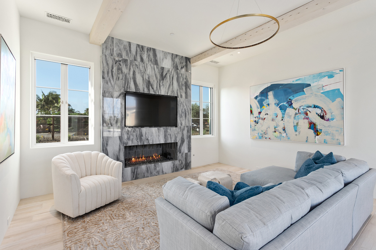
Next, choose a few accent colors that complement the primary color. These hues can be bolder shades or more subtle, depending on your preference. For example, pairing navy blue with a neutral palette adds sophistication, while a combination of sage green and light taupe evokes a serene, nature-inspired feel. The key is to ensure that these accent colors appear in multiple rooms, creating a sense of cohesion and consistency.
In terms of furniture and décor, use your accent colors to guide the choices for upholstery, pillows, throws, artwork, and wall décor. This will reinforce the color flow across the home.
Connecting Rooms with Transitional Spaces
Transitional spaces, such as hallways, entryways, and open-plan living areas, act as bridges between rooms. These areas are key to ensuring that the color flow doesn’t feel jarring when moving from one room to the next. Properly designed transitional spaces help ease the visual transition from one room to another, especially when there’s a shift in style or mood.
One way to connect rooms is by continuing the same color in transitional areas. For instance, if you’ve used a neutral color palette in your living room, you might carry that same neutral tone into your hallway or entryway. For added depth, accent colors can be subtly introduced into these transitional spaces through accessories, artwork, or even lighting.
Another approach is to use gradual transitions by adjusting the intensity or tone of the colors as you move through the rooms. In a hallway, for example, you might use a softer version of the main color in the living room. This gradual shift ensures that the flow between spaces is gentle and natural.
Consider adding texture to these transitional areas as well. Wall treatments like textured wallpapers or wainscoting can bring visual interest to corridors and entryways while maintaining color consistency. For a more modern approach, consider wall-mounted shelves or sleek cabinetry in the same color palette to keep the flow smooth and uncluttered.
Using Color to Define Zones
In larger spaces, especially open-concept areas, it’s important to visually define different zones within the same room without creating division. This is where color can be incredibly helpful in ensuring a seamless transition between functional spaces while still feeling unified.
For example, in an open-concept living and dining area, you can use color to define each space. Paint the living area with a slightly deeper shade of your dominant color to create a sense of coziness and intimacy, while keeping the dining area in a lighter version of the same color to maintain the open feel. Alternatively, you can use a colorful accent wall or wallpapers with similar hues that work cohesively within the overall palette.
For homes with multifunctional spaces, such as home offices within living rooms, color blocking can help delineate the workspace without using physical dividers. This approach maintains a sense of fluidity while giving each zone a distinct visual purpose.
Accent Colors and Texture: Adding Interest Without Overpowering
Accent colors can enliven a space, but the trick is to use them thoughtfully. These colors should be added in a way that enhances the overall flow of the home, rather than disrupting it. Introduce accent colors through pillows, artwork, area rugs, and furniture.
Textiles and patterns play a key role in maintaining a harmonious flow. Use fabrics in the same accent colors but in varying textures to add interest. For instance, pair a soft velvet cushion with a woven linen throw, or opt for a striped rug that incorporates your accent colors in a subtle way.
When selecting wall décor such as art prints or mirrors, choose pieces that integrate your accent hues. A striking painting with shades of gold or deep green can draw attention to a focal wall while still tying into the overall color palette.
Color Flow in Smaller Spaces
In smaller spaces like bathrooms or bedrooms, maintaining a cohesive color flow can be more challenging. However, the same principles apply. For instance, you can introduce the same dominant or accent color across different rooms through small accessories or wall treatments.
In bathrooms, use soft, neutral tones as the base color for walls, tiles, and cabinetry, then add accent tiles or decorative pieces that reflect the color palette used in the adjacent spaces. In smaller bedrooms, adding a statement piece of furniture or bed linens in an accent color can tie the space to the rest of the home’s color flow without overwhelming the room.
The Importance of Lighting in Color Flow
Lighting can greatly impact how colors appear in a room. The natural light in a room can bring out the richness of certain shades, while artificial lighting can change the way a color looks during the evening. To ensure your color flow remains consistent, pay attention to the lighting in each room.
Natural light is ideal for showcasing vibrant accent colors, especially in living rooms or kitchens. Daylight streaming through large windows can make colors appear fresh and lively, whereas softer light in bedrooms can highlight warmer hues, creating a calming effect.
To enhance your color flow in the evening, use layered lighting that highlights the key elements in each room, whether it’s table lamps, floor lamps, or track lighting. Warm light can make deep colors in your home feel inviting and cozy.
Final Touches: Personalizing with Accessories
No design is complete without personal touches that make it feel like home. Accessories, such as vases, artwork, lighting, and textiles, help to bring everything together, offering opportunities to inject your personality into the design. Keep accessories in line with your chosen color palette to maintain the cohesive flow.
A gallery wall can feature a selection of framed photos or artwork in accent colors that you’ve used throughout the space. Decorative trays, ceramic bowls, and throw blankets offer an easy way to add layers of color while keeping the overall feel cohesive and intentional.
Conclusion: A Harmonious Flow for a Polished Home
Creating a harmonious color flow throughout your home doesn’t require drastic changes or an overwhelming number of colors. With a thoughtfully curated color palette, you can make every space feel connected, cohesive, and intentional. By using transitional spaces wisely, incorporating accent colors, and choosing the right textures and finishes, you can ensure your home feels unified while allowing each room to shine on its own.
A coordinated color flow turns your home into a true reflection of your style and personality. When every room complements the next, your home becomes a place that feels polished, inviting, and beautifully designed. Every detail matters, and the perfect color flow enhances not just the aesthetics but the overall energy of the space.
Let Kern & Co Designs help you create a space that feels fluid, cohesive, and well-thought-out—where color flows naturally from room to room, making your home feel like a true masterpiece.
Interior Design Articles